
The Authorizations Dashboard is your go-to tool for understanding how well your transactions are being approved, where friction exists, and how performance varies by group (e.g., issuer, card type, PSP).
It offers a full view from high-level KPIs to trend charts to deep pivot-based analysis, giving you everything you need to monitor and optimize your approval strategy.
KPI Section (Top)

|
KPI |
Description |
|---|---|
|
Auth Attempts |
The total number of authorization attempts in the selected date range. |
|
Approved Transactions |
The total number of successfully authorized transactions in the selected date range. |
|
Approved Sales |
The total dollar amount approved across all transactions. |
|
Approval Rate |
% of total authorization attempts that were approved. |
|
Average Approval |
Average dollar amount per approved transaction. |
KPI values always reflect the last complete month of data. Use the Date Range selector below to control what the Charts and Data tabs display — this is a separate control from the KPIs.
Date Range for Charts and Data
Below the KPI tiles, the Date Range for Charts and Data selector controls the time window displayed across all charts, the DATA tab, and the BIN DATA tab. It defaults to Last 6 months including this month. Adjusting this selector does not affect the KPI tiles above, which always reflect the last complete month.
Charts Tab (Dynamic Charts)
This section helps you explore how authorization metrics trend over time and vary across different dimensions. The charts are fully interactive and dynamically update based on selected groupings.
Chart titles are dynamic: each one rewrites itself to match the Measure and Group controls you select. The headings below therefore describe each chart at its default settings — if the title on screen does not match, check those controls rather than assuming you are looking at a different chart.
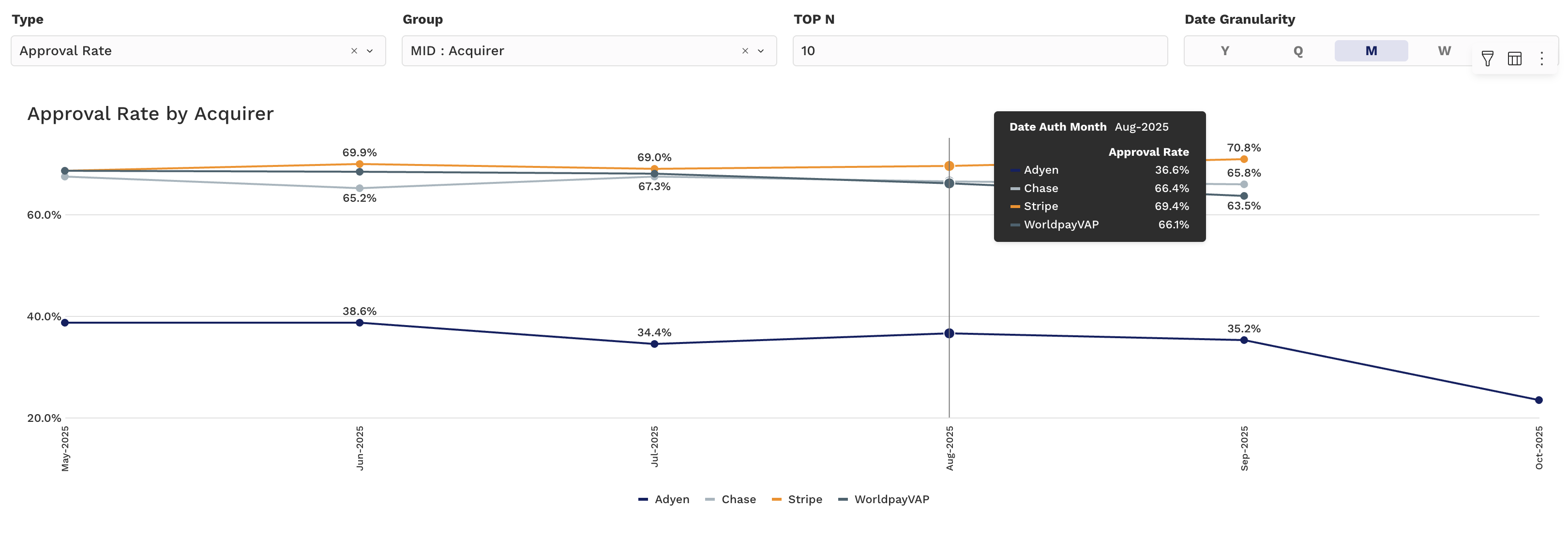
Chart 1: Approval/Decline Rate Over Time (Line Chart)
-
Y-Axis: Approval Rate/Decline Rate(%)
-
X-Axis: Time (Day, Week, Month, etc.)
-
Grouping: Select from pre-defined fields (e.g., Card Brand, Issuer, PSP)
Use this chart to spot drops in approval rate and investigate by group.
Chart 2: Count & Amount Comparisons (Stacked Bar)
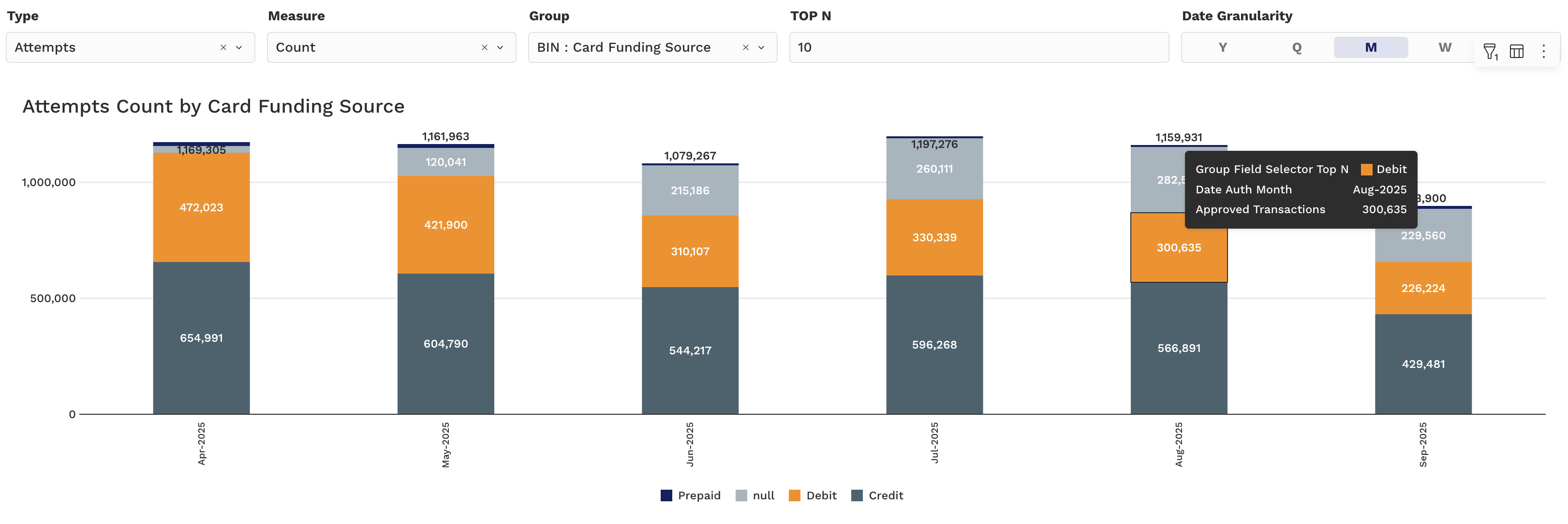
This chart allows you to analyze volume and value trends by selected groupings using the Type and Measure Controller:
Type Options:
-
Attempts - Auth Attempts
-
Approvals - Approved auths
-
Declines - Declined auths
Measure Options:
-
Count – Total number of selected type
-
Amount – Total $ value of selected type
-
% of Total Count – Share of volume by group
-
% of Total Amount – Share of $ value by group
Use these to:
-
See how authorization success is distributed across top Acquirers, MIDs, or Card Networks
-
Identify high-volume but low-conversion segments
Use the date granularity and group selectors to fine-tune your comparisons.
Chart 3: Attempts by Group (Horizontal Bar)
A horizontal bar chart whose axes follow whatever you choose in the Group controls. The Issuer Country × Card Funding Source view is one configuration of this chart rather than a chart of its own — the settings below produce it, and changing Group 1 or Group 2 re-points the same chart at another dimension.
-
Y-Axis: the Group 1 field — here Issuer Country (top N countries by volume, configurable)
-
X-Axis: the selected measure — here Attempt Count
-
Group 1: BIN : Issuer Country
-
Group 2: BIN : Card Funding Source (segments: Debit, Credit, Prepaid, null)
-
Controls: Type, Measure, Group 1, Group 2, TOP N, Date Granularity
Use this chart to identify which countries are driving your authorization volume and how funding source mix varies by market — useful for international expansion and fraud risk analysis.
Chart 4: Approval Rate by Issuer Country (World Map)
-
Visualization: Interactive choropleth map — countries shaded by approval rate intensity
-
Countries with missing BIN mapping are flagged separately (e.g., "20 missing")
Use this map to quickly spot geographic patterns in authorization performance — low-approval regions may indicate issuer friction, FX issues, or fraud filters worth investigating.
Chart 5: Approval Rate by Issuer Region (World Map)
A separate map from Chart 4 — there is no country/region toggle. It shades the same approval rate aggregated to issuer region instead of individual country.
-
Visualization: Interactive choropleth map — regions shaded by approval rate intensity
-
Use it when single-country volume is too thin to read reliably; regional aggregation smooths out small markets so a genuine performance gap stands out from ordinary noise.
Chart 6: Approval Rate by Week Day and Month Day (Heatmap)
-
Rows: Week Day (Mon–Sun)
-
Columns: Month Day (1–31)
-
Cell values: Approval Rate for that day-of-week / day-of-month combination
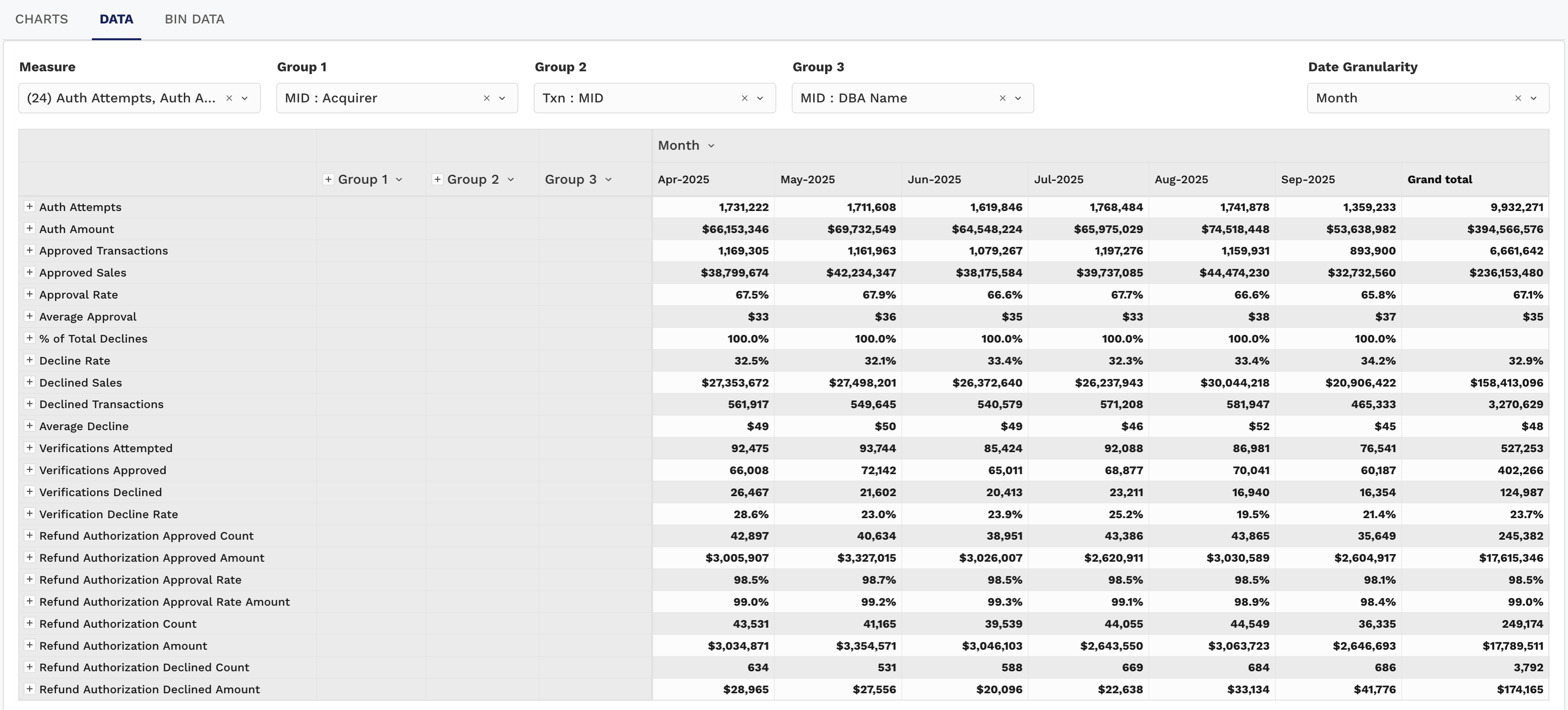
The DATA and BIN DATA tabs provide granular, table-based views of your authorization data, ideal for power users and ops teams.
Pivot Table Metrics (Values):
-
Auth Attempts
-
Auth Amount
-
Approved Transactions
-
Approved Sales
-
Approval Rate
-
Average Approval
-
% of Total Declines
-
Decline Rate
-
Declined Sales
-
Declined Transactions
-
Average Decline
-
Verifications Attempted
-
Verifications Approved
-
Verifications Declined
-
Verification Approval Rate — Share of verification attempts that were approved; read it next to Approval Rate, since account verifications can succeed or fail on different grounds than a charge.
-
Verification Decline Rate
-
Refund Authorization Approved Count
-
Refund Authorization Approved Amount
-
Refund Authorization Approval Rate
-
Refund Authorization Approval Rate Amount
-
Refund Authorization Count
-
Refund Authorization Amount
-
Refund Authorization Declined Count
-
Refund Authorization Declined Amount
Interactions:
-
Use dropdowns to group by Issuer, BIN, Card Type, Acquirer, etc.
-
Export tables to CSV for deeper reconciliation or reporting
-
Drill into cells to view breakdowns or apply filters
This section is ideal for answering specific operational questions like:
-
"Which issuers have the lowest approval rates?"
-
"Where is the average approval amount significantly higher/lower than average?"
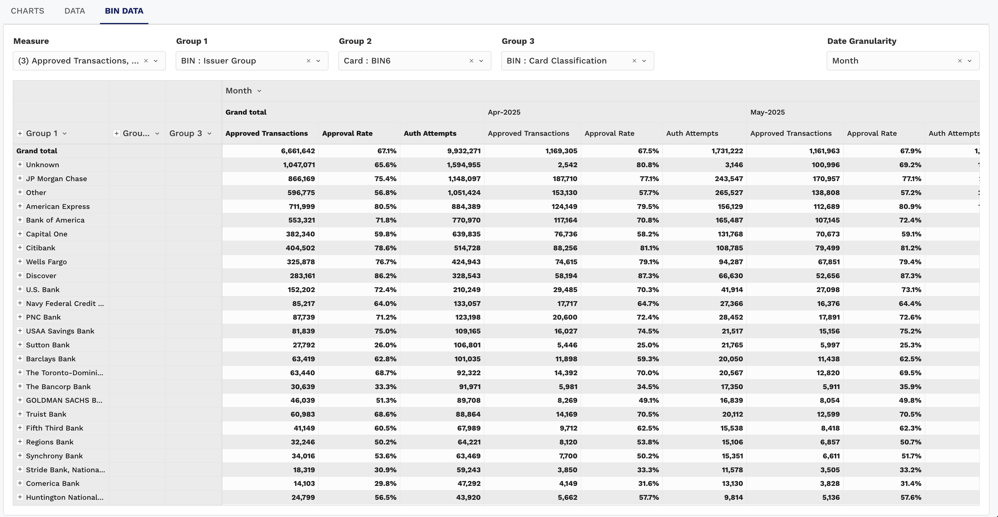
BIN Data
-
DATA
-
Displays all available metrics by default — 24 auth metrics available in the Measure dropdown.
-
Supports up to 3 configurable groups (e.g., Group 1: MID : Acquirer → Group 2: MID : Role → Group 3: MID : DBA Name).
-
Metrics are arranged in rows, allowing side-by-side comparison across many values at once.
-
Best for broad exploratory analysis where you want to scan across multiple KPIs.
-
-
BIN DATA
-
Pre-selects 3 measures by default: Approval Rate, Approved Transactions, and Auth Attempts.
-
Supports up to 3 configurable groups — defaults to BIN : Issuer → Card : BIN → BIN : Card Product Type.
-
Metrics are arranged in columns, making it easier to compare performance across BINs.
-
Best for focused BIN-level analysis where fewer measures are needed.
-
Use DATA when you want maximum flexibility and breadth, and use BIN DATA when you want quick BIN-specific comparisons with a simplified layout.
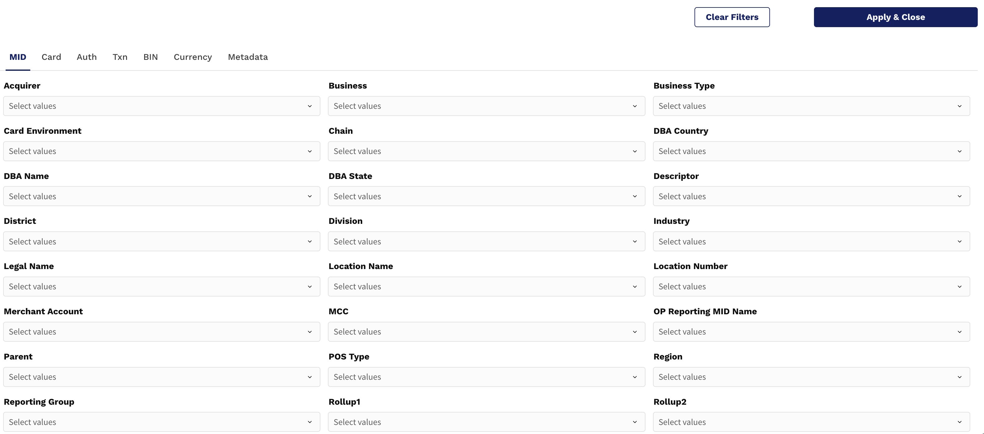
To tailor the Authorizations Dashboard to your needs:
-
Use the Filters button (top right) to set your Date Range or filter by Card Brand, Acquirer, Issuer, and more.
-
Group data by Card or MID to explore trends by strategic segments.
-
Apply Top N to focus on high-volume contributors.