
🚫 Declines Dashboard
The Declines Dashboard is designed to help you understand why transactions are failing, where declines are concentrated, and how to reduce friction in your authorization funnel.
By combining summary KPIs, trend charts, and dynamic pivot tables, this dashboard helps you pinpoint problems and prioritize recovery or routing strategies.
🧮 KPI Section (Top)
This section shows your most critical decline-related metrics, giving you a quick overview of trends and totals during the last complete month.
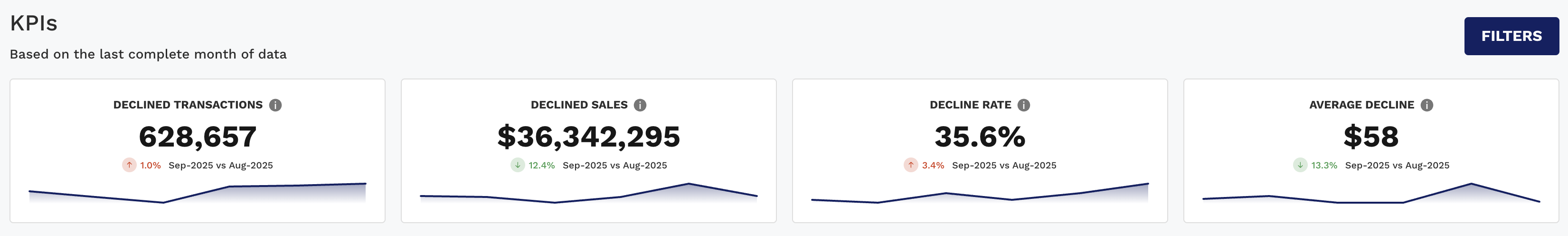
KPI | Description |
|---|---|
Declined Transactions | Total number of authorization attempts that were declined. |
Declined Sales | Total dollar amount of those declined transactions. |
Decline Rate | % of total authorization attempts that were declined. |
Average Decline | Average value of a declined transaction. |
📌 Each KPI includes a period-over-period comparison with trend indicators (green = good, red = needs attention), so you can track performance month to month.
📈 Charts Tab (Dynamic Charts)
This section helps you visually analyze when, where, and why declines are happening, using flexible, interactive visualizations.
📊 Chart 1: Decline Rate Over Time (Line Chart)
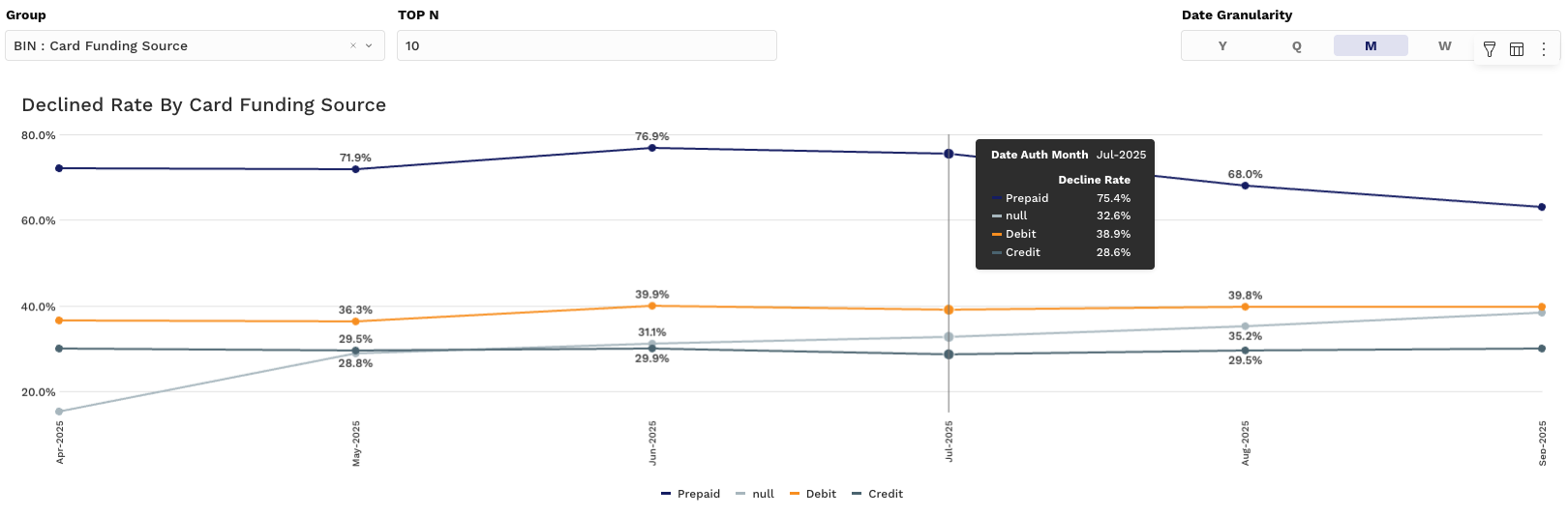
Y-Axis: Decline Rate (%)
X-Axis: Time (Month, Week, etc.)
Grouping: Choose from pre-defined options (e.g., Card Type, Issuer, Acquirer, Decline Reason)
Use this chart to identify dips or spikes in decline rate and correlate them with operational or routing changes.
📊 Charts 2 & 3: Volume & Value Breakdown (Stacked Bar)
These charts give you a deeper understanding of the distribution of declines by category.
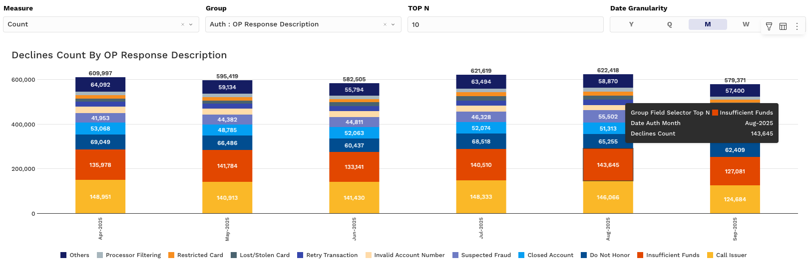
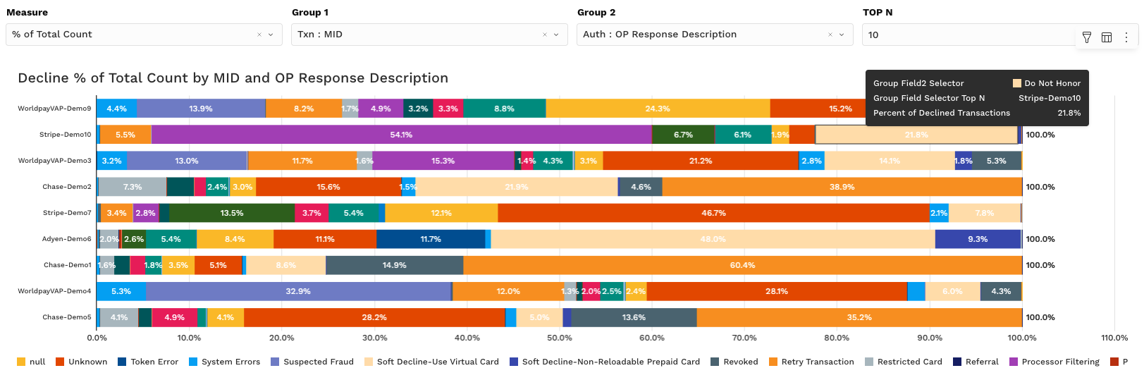
Measure Options via the Measure Controller:
Count – Number of declined transactions
Amount – Total $ value of declined transactions
% of Total Count – Share of total declined transactions per group
% of Total Amount – Share of declined dollar volume per group
🧠 Use these to:
Surface top decline contributors (e.g., Top 10 Issuers, Top Decline Reasons)
Identify card types or payment methods with unusually high decline ratios
📌 Group controls and granularity selectors let you adjust views on the fly to fit your analysis window.
📊 Pivot Tab (Dynamic Pivot Tables)
This section gives you full control over how you slice and drill into decline-level data.
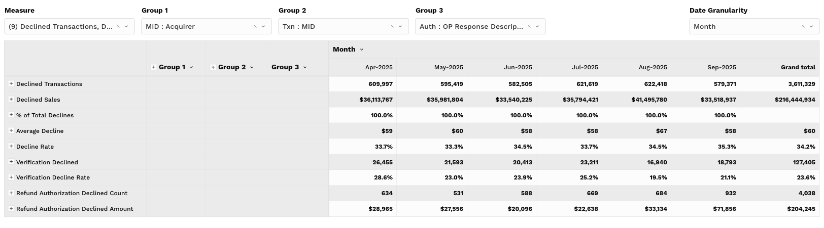
📉 Pivot Table Metrics (Values):
Declined Transactions
Declined Sales
% of Total Declines
Average Decline
Decline Rate
Verification Declined
Verification Decline Rate
Refund Authorization Declined Count
Refund Authorization Declined Amount
🔧 Key Interactions:
Group by Card Type, Issuer, BIN, Reason Code, Acquirer, or MID
View breakdowns by time period (Day, Week, Month, etc.)
Filter, export, and toggle columns for flexible reporting
📌 This is your go-to view for root cause analysis and detailed vendor/issuer performance tracking.
🔍 Filtering Tips
Use the Filters to refine your view across all elements:
Date Range: Default is the last 180 days, but you can adjust to your desired window
Grouping Filters: Narrow in on specific acquirers, card networks, issuer banks, or even individual decline reasons
Top N: Focus only on your highest-impact records (e.g., Top 10 Issuers by Decline Count)