
💸 Fees Dashboard
The Fees Dashboard is built to give you deep visibility into the cost of processing payments — including total fees, effective rate, downgrade performance, and cost breakdowns across acquirer, network, and interchange.
Whether you're reconciling processor invoices, identifying optimization opportunities, or managing cost-of-sales, this dashboard helps you quantify every dollar spent per transaction.
🧮 KPI Section (Top)
This section displays essential cost-related metrics to help you quickly evaluate your fee efficiency and areas of potential savings.
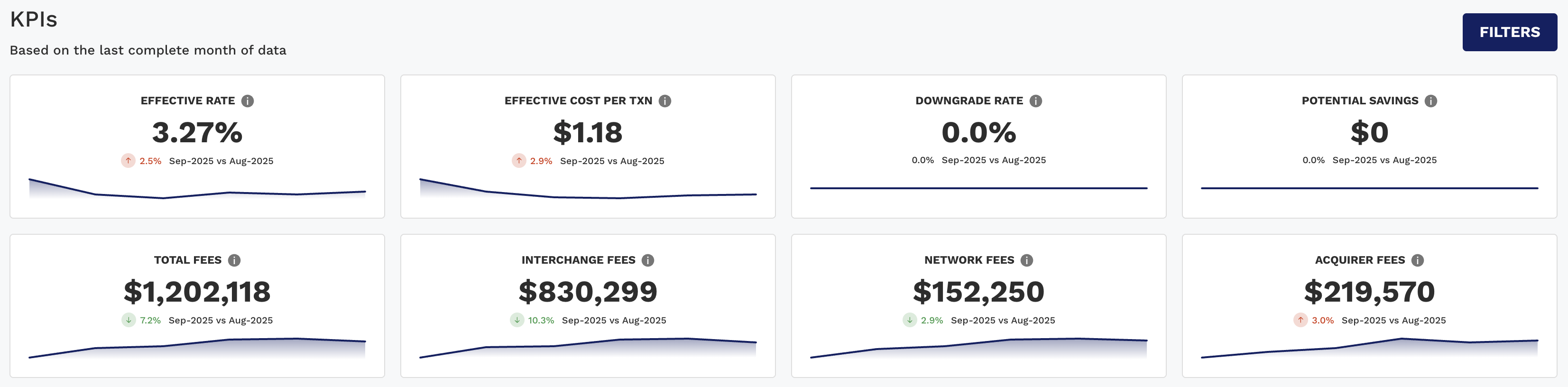
KPI | Description |
|---|---|
Effective Rate | Total fees ÷ Net Sales — your blended cost of processing. |
Effective Cost Per Txn | Average cost per transaction in dollars. |
Downgrade Rate | % of transactions that downgraded from qualified interchange categories. |
Potential Savings | Estimated $ that could be saved by optimizing downgrade or fee scenarios. |
Total Fees | Combined dollar amount of all fee categories. |
Interchange Fees | Total cost paid to issuer banks. |
Network Fees | Total cost paid to the card brand networks. |
Acquirer Fees | Processor/acquirer-specific charges. |
📌 Period-over-period comparisons, color-coded arrows, and trendlines help users track how fee performance is evolving.
📈 Charts Tab (Dynamic Charts)
The chart section features stacked bars and line chart to visualize fee composition and trends in an intuitive way.
📊 Dynamic Charts 1–3 (Segmented Views)
📉 Chart 1: Effective Rate by Group
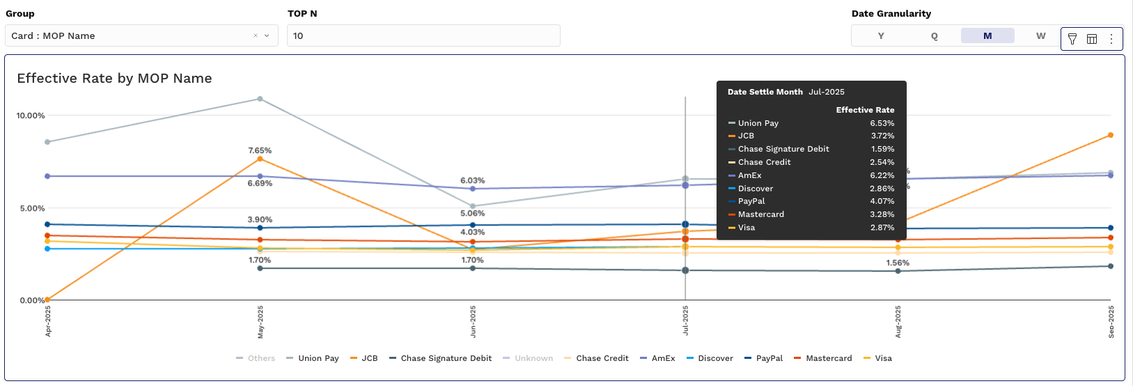
Y-Axis: Effective Rate (%)
X-Axis: Time (Month, Week, etc.)
Grouping: By Acquirer, Merchant ID, MOP, or Card Type
📊 Charts 2 & 3: Fee Distribution
Allow you to analyze fee totals by business dimensions.
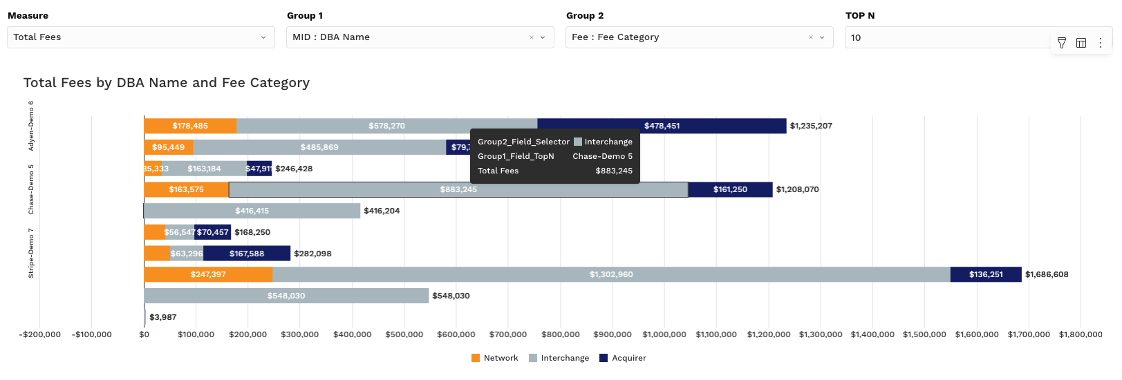
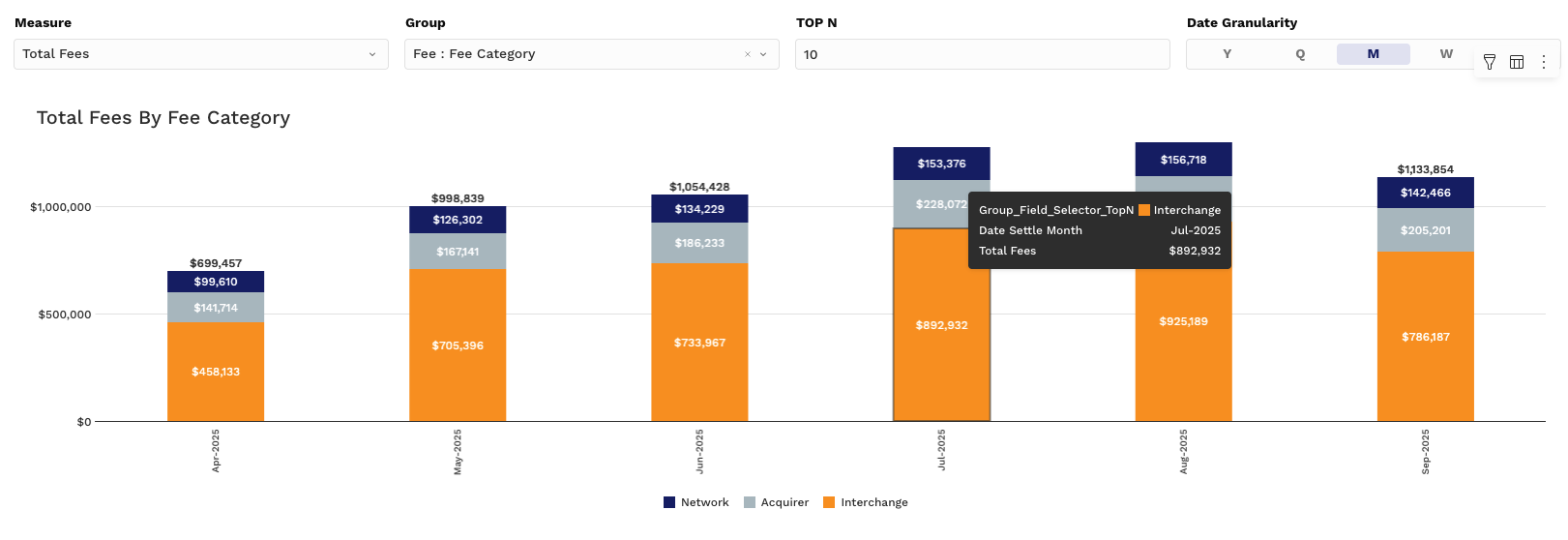
Measure Controller Options:
Total Fees – Raw dollar value
% of Total Fees – Contribution by group (e.g., which MIDs or payment methods drive the most cost)
📌 Group controls and granularity options make these charts flexible and powerful for cost investigation.
📊 Pivot Tab (Dynamic Pivot Tables)
This section gives users a line-item breakdown of fees with grouping and drill-down capabilities, ideal for reconciliation, performance tracking, and vendor analysis.
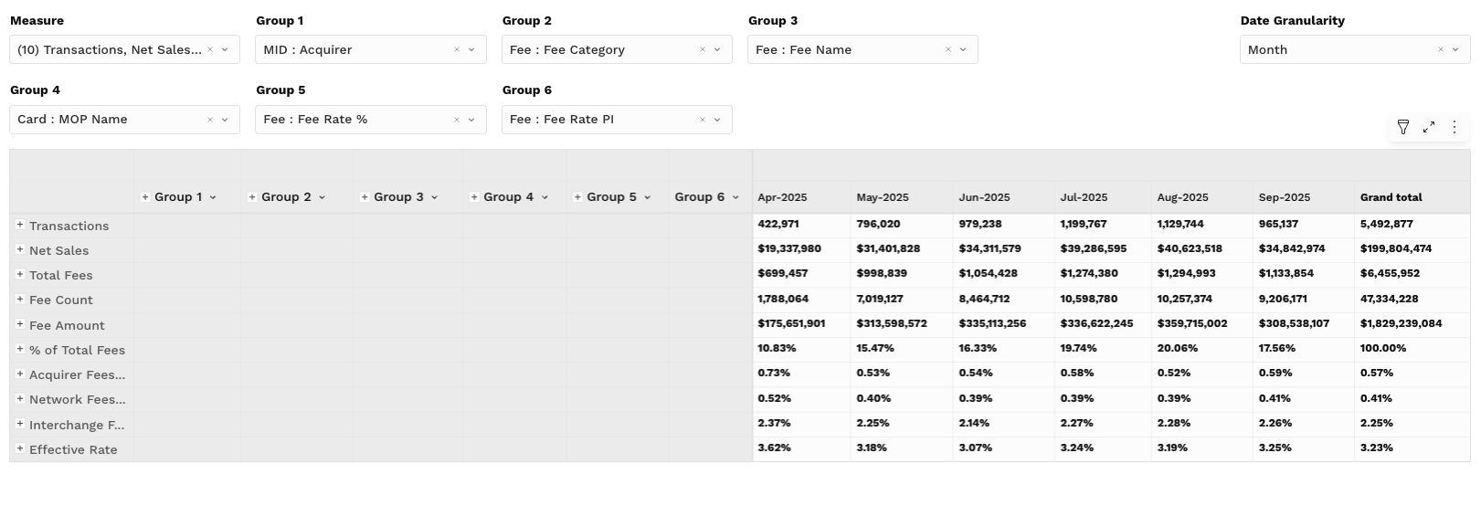
📉 Pivot Table Metrics (Values):
Transactions
Net Sales
Total Fees
Fee Count
Fee Amount
% of Total Fees
Acquirer Fees Effective Rate
Network Fees Effective Rate
Interchange Fees Effective Rate
Effective Rate
🔧 Interactions:
Group by Acquirer, Merchant ID, Card Type, BIN, or Issuer
View data across time intervals (Month, Week, Day, etc.)
Export for reconciliation or invoice validation
📌 This view is ideal for uncovering cost trends, verifying processor charges, and identifying downgrade patterns.
🔍 Filtering Tips
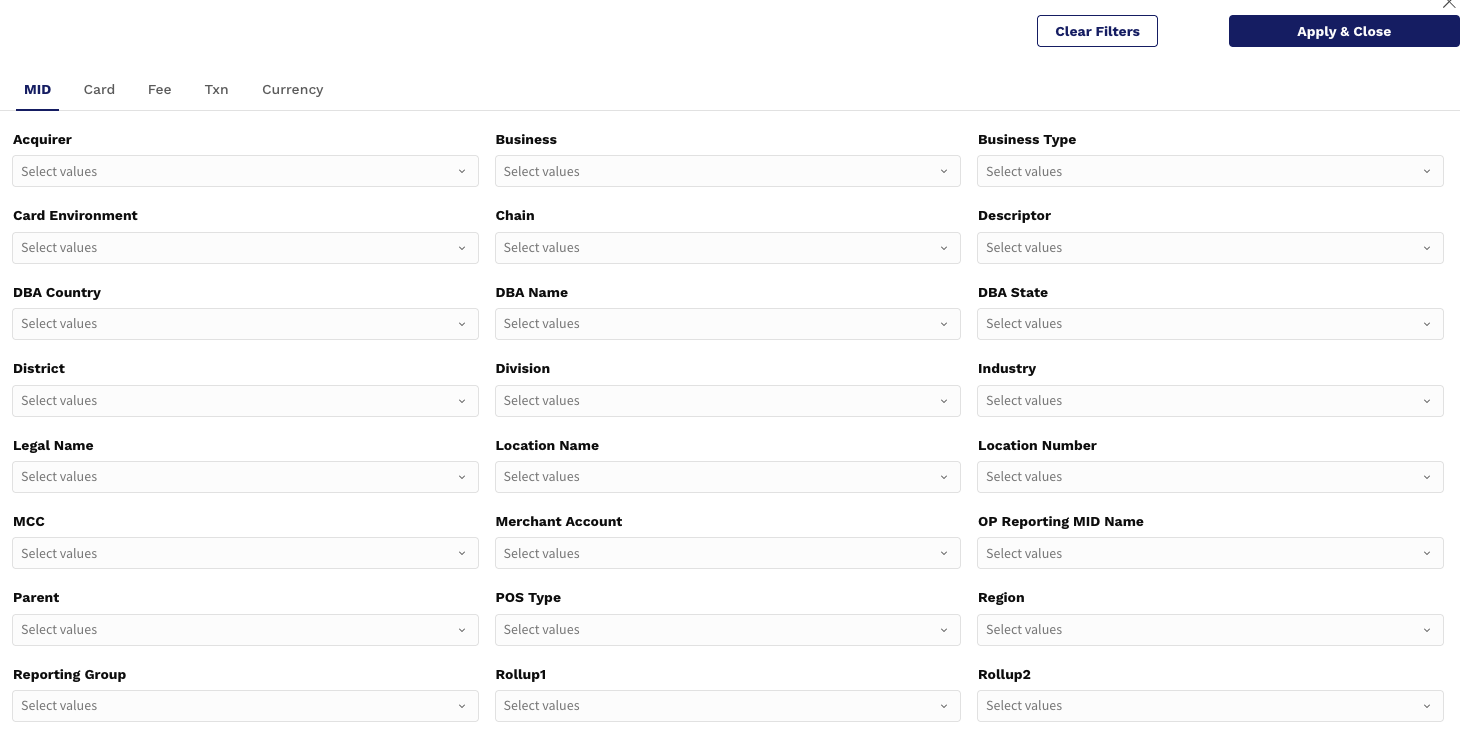
Customize your view of fees with powerful filters:
Date Range: Focus on current cycle, quarter, or year-to-date
Group Filters: Filter by Currency, Acquirer, MOP, Card Brand, etc.
Top N: Analyze only the highest contributing groups (e.g., top 10 acquirers by fee amount)
💡 Use Case Example:
“Which PSPs are contributing most to our effective cost, and how much of it is due to interchange?”
Go to Pivot Tab
Group by Acquirer
Compare Total Fees vs. Interchange Fees
Review Effective Rate trend in Chart 1