
📊 Using the Dashboards
Each Harmonize Analytics dashboard follows a standardized structure to ensure users can intuitively explore KPIs, trends, and detailed data — without needing advanced technical skills. The three primary sections are:
KPIs (Top Section)
Charts (Tab 1)
Data (Tab 2)
Filters (Accessible via Filters Button)
1️⃣ KPIs – Key Performance Indicators
Location: Top of each dashboard
Purpose: Instant visibility into your most important metrics
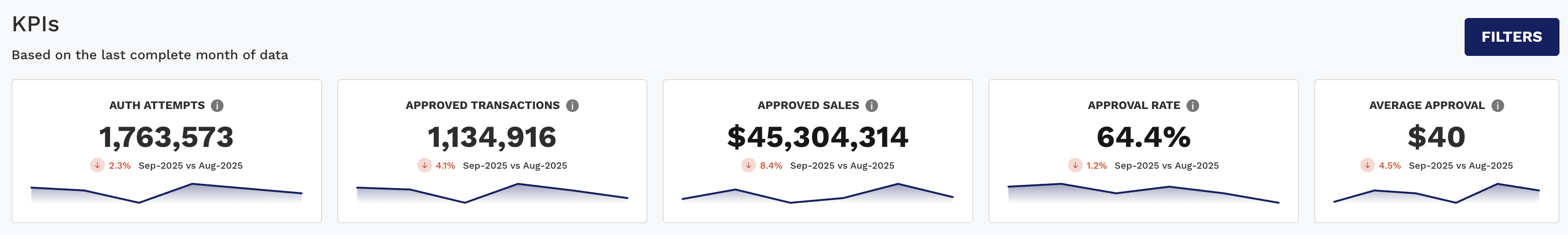
✨ Features:
Bold, prominent display of current values (e.g., Sales, Approval Rate)
Period-over-period comparisons (Completed month compared to the last month) with arrows and color-coded indicators:
▲ Green = Positive Trend
▼ Red = Negative Trend
📌 Tip: Hover over trendlines to view historical values.
2️⃣ Charts – Visual Trends
Location: First tab under KPIs
Purpose: Understand how your metrics evolve over time or across groups
🧠 Chart Types:
Rate Time Series (stacked line): e.g., Approval Rate by Card Type
Total Time Series (stacked bar): e.g., Sales Amount by Acquirer
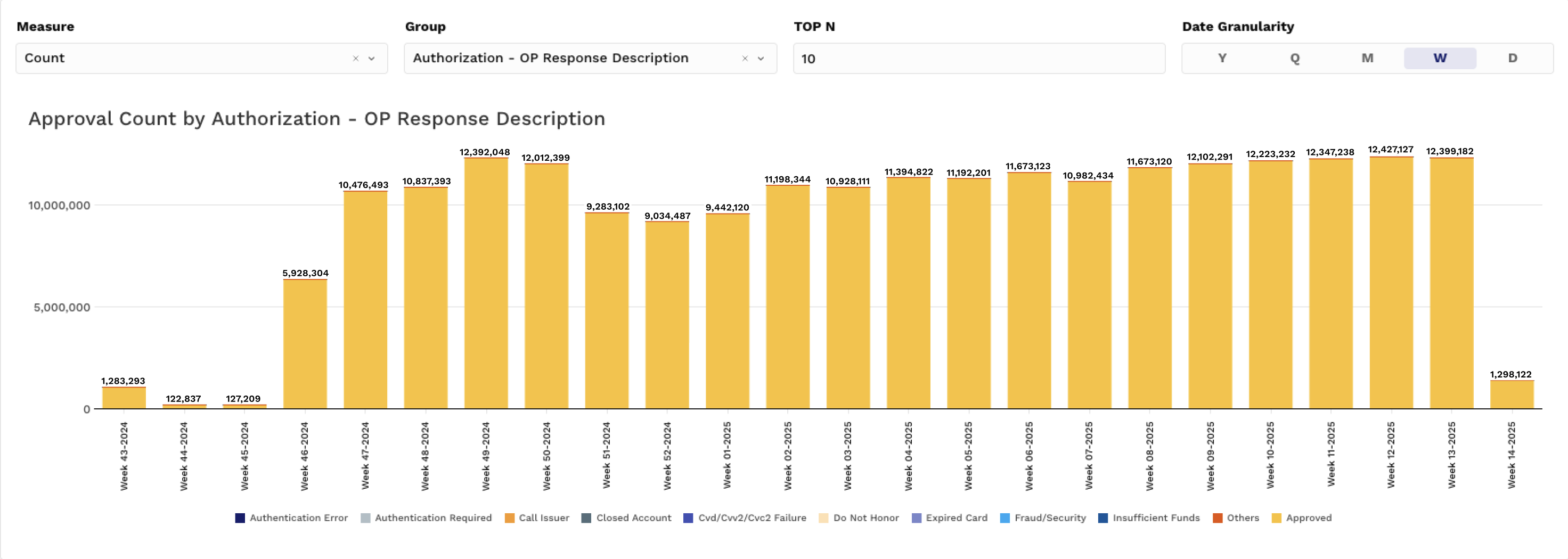
Group Comparison (stacked bar): e.g., Chargeback % by Card Network & BIN
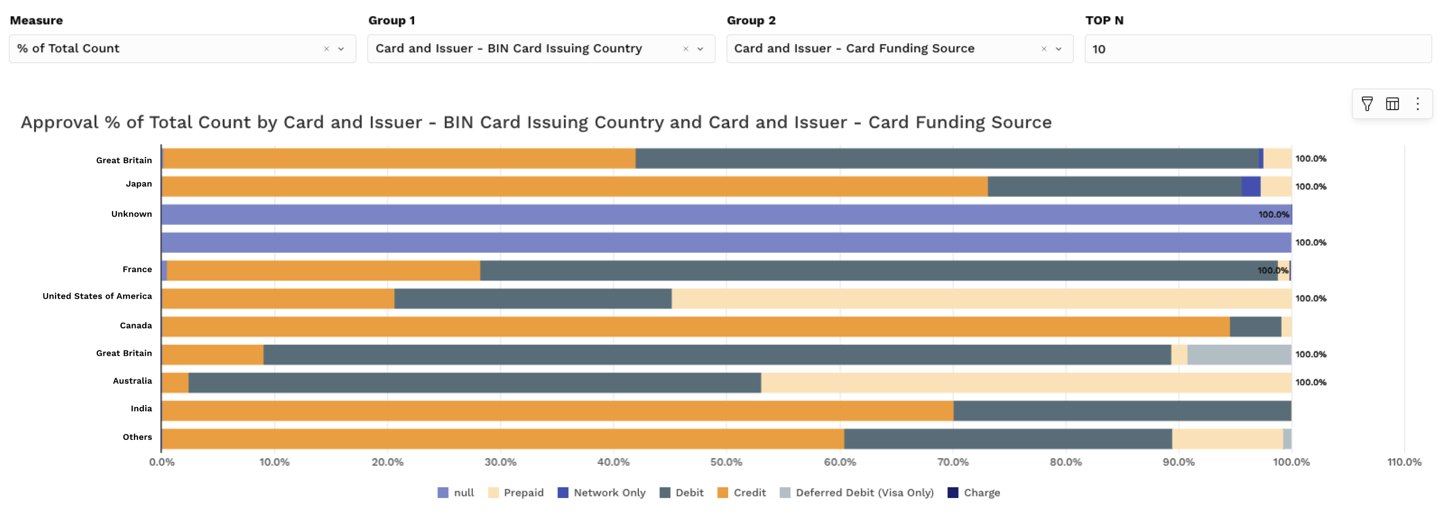
🔍 Controls:
Group by Fields – Choose a pre-defined group (e.g., Acquirer, Card Network)
Y-axis selector – Count, Amount, Rate, % of Total
Date Granularity – Year, Quarter, Month, Week, Day
📌 Pro Tip: Hover over bars/lines to reveal values, then click to filter the full dashboard.
3️⃣ Pivots – Granular Data Tables
Location: Second tab
Purpose: Analyze segmented data with more detail
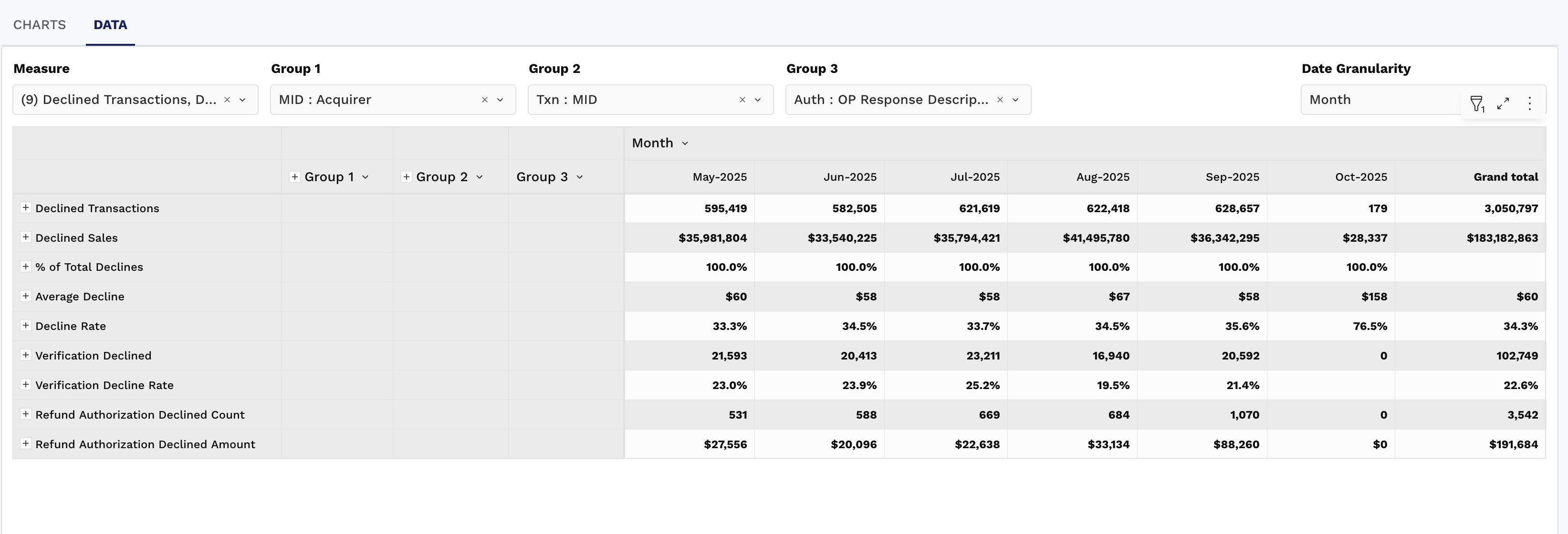
🧱 Features:
Pre-defined groupings by dashboard type (e.g., Card, BIN, MID)
Up to 3 levels of grouping (e.g., Card Type → Issuer → BIN)
Drill into trends by row
Show/hide values and group fields
Default time groupings (Month) with support for Day, Week, Quarter, Year
📌 Use pivot menus to toggle layout or export data.
4️⃣ Filters – Tailor Your View
Location: Top right → “Filters” button
Purpose: Refine what’s displayed across KPIs, Charts, and Pivots
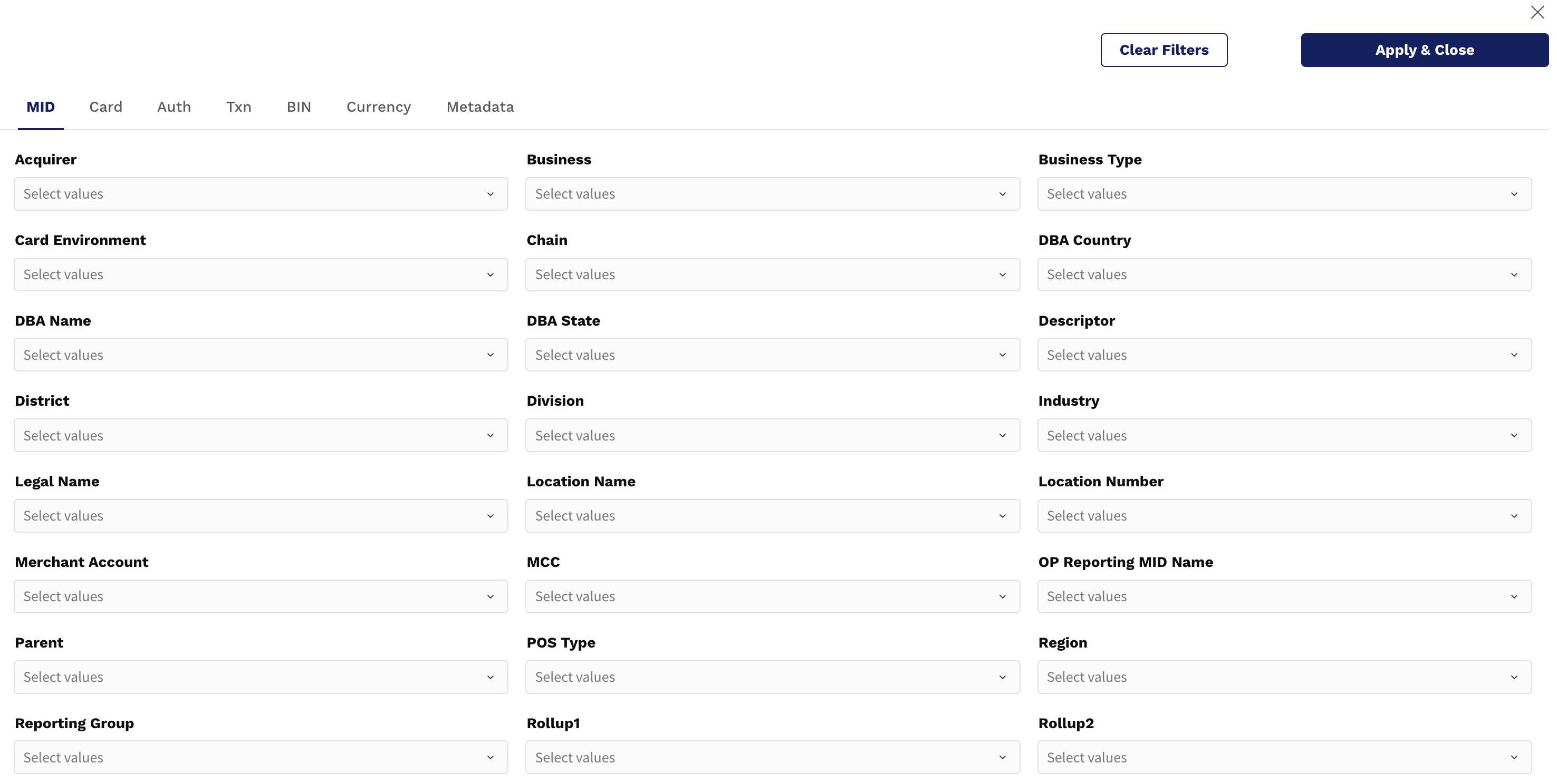
🎛️ Field Group Filters
Filter by specific merchants, issuers, card brands, etc.
Uses the same predefined groups as your charts and pivots
🖱️ Hover Actions & Element Menu
When you hover over any KPI, chart, or pivot table, you'll see a three-dot menu (︙) in the upper-right corner of the element. This opens a powerful interaction menu:
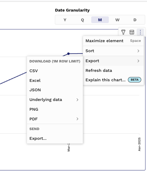
Option | What It Does |
|---|---|
Maximize Element | Expands the chart/table to full screen for focused analysis |
Sort | Reorder grouped elements by value, name, or metric |
Export | Download the chart or table in CSV, Excel, JSON, or PDF |
Refresh Data | Re-pulls the most recent data for the current visualization |
Explain This Chart… | AI-powered insights to help explain what you're seeing and why certain trends may be occurring |
🔍 Filters — Customize the View
Click the Filter icon in the dashboard or use the global Filters panel to refine your view by:
Date Range
Method of Payment (MOP)
Issuer, BIN, Acquirer
Merchant ID or Group
Card Brand, Region, etc.
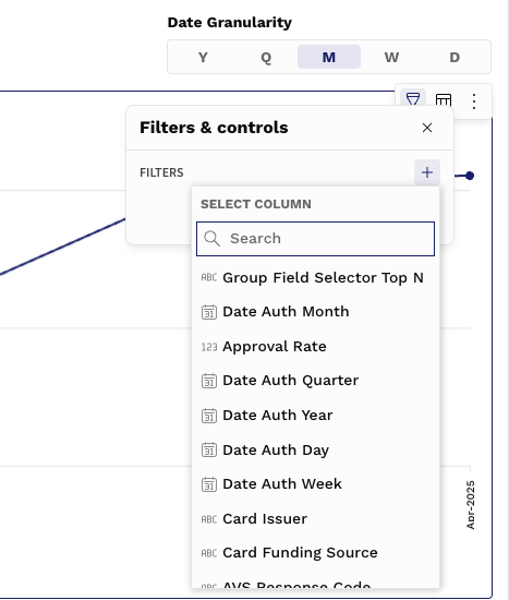
💡 Pivot Tip:
When viewing pivot tables, filters are especially helpful for narrowing large datasets down to a manageable view before exporting. For example:
👁️ Show Underlying Data
For any chart or KPI, you can choose “Show underlying data” to see the summary-level records that power the visualization.
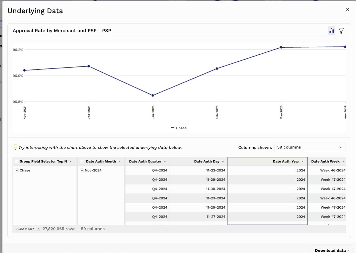
Use this feature to:
Validate metric calculations
Review grouped values (e.g., all Acquirers in a stacked bar)
Get confidence before acting on a visual trend
🤖 Explain This Chart… (BETA)
Our AI-assisted “Explain This Chart…” feature helps interpret what you're seeing:
Detects trends, outliers, and changes in chart patterns
Offers natural-language explanations of what may be driving performance
Helps non-technical users and business stakeholders understand key shifts at a glance
📌 Use this as a starting point to ask better questions or dig deeper with filters and pivots.
⬇️ Exporting Data
All dashboard elements can be exported via the Export option in the menu:
Format | Use Case |
|---|---|
CSV | Import into Excel, Sheets, or a database |
Excel | Finance-ready format for structured reporting |
JSON | Ideal for programmatic use or API tools |
Shareable visual format for presentations or documentation |
⚠️ Exports reflect all active filters — always apply filters first for clean downloads.
🧠 Summary
These core functions are consistent across all Harmonize dashboards, giving you:
Full control over what you’re viewing
Instant transparency into how metrics are calculated
Flexible outputs for team workflows and reporting